Rage game design
This is the first time I've ever written one of these. Here we go.
Before we even found out about the rage jam, we were watching some speed runs of the impossible game. We found the jam incidentally after this. This sparked a discussion about what makes a rage game a rage game.
It had to fit a specific set of criteria:
- Be high energy
- Fail fast (as a player)
- Be intuitive to pick up and play, with obvious mechanics
- Reward the player's progress
- Infuriate, don't frustrate
- KISS (Keep it simple, stupid)
So, let's go through each of these.
High energy
We accomplished this through things that would hit adrenaline hard - the music, the camera shake, the particle effects, even the increased shake on death to hit home "You died, try again".
We were actually initially looking at Bossfight for inspiration for the music - specifically the song "Milky Ways".
This song had an energy close to that of what we were looking for - high energy, and easy to groove to. Raises your heart rate a bit as you get into it, but not so in your face that it hinders gameplay. In the end, we sent this to a friend of ours (Clipsey) and asked for anything they could do that could somewhat match the energy. They just so happened to have an old project that matched pretty much perfectly, so we rolled with it!
Fail fast (as a player)
In many games, you have a whole death animation and respawn animations. In games, this usually acts to let the player catch their breath and prepare for the next level. We don't want that in a rage game, so we toss it and respawn them immediately. Instant feedback, restart the level timer, let's go.
Be intuitive to pick up and play, with obvious mechanics
We used a common trope here. While we went for a standard control scheme, we did display controls on the back wall. This worked out beautifully. It's not quite as good as Valve Software's Portal series, but the pacing of "teach one mechanic per room" definitely rings true here, building onto old mechanics we previously introduced (moving, jumping, resetting, dashing).
Reward the player's progress
Here we do this by giving frequent checkpoints. Each room is between 3 and 8 seconds long - not very long to complete them. Every room is a checkpoint. By having the game in short stints like this, we can very easily show the player that they are progressing with minimal effort, giving a high payoff, tempting them with getting further and further.
Infuriate, don't frustrate
One thing that a lot of developers attempt to do with rage games when starting out is that they try to just throw annoying obstacles at the player - see games like the japanese cat mario game, Syobon Action (http://www.gatobros.com/syobon.html) - where it just tries to throw annoyances at the player and tries to deceive expectations. The problem with this is that the player doesn't feel like their failures are their own, but are instead caused by the game not playing by the rules. If a player feels like they are being cheated, they won't want to play, so we do whatever we can right from the design stage to avoid this. Keep the controls responsive and accurate, and let the player feel like they are in control, and they'll try harder to see the game to its end.
KISS (Keep it simple, stupid)
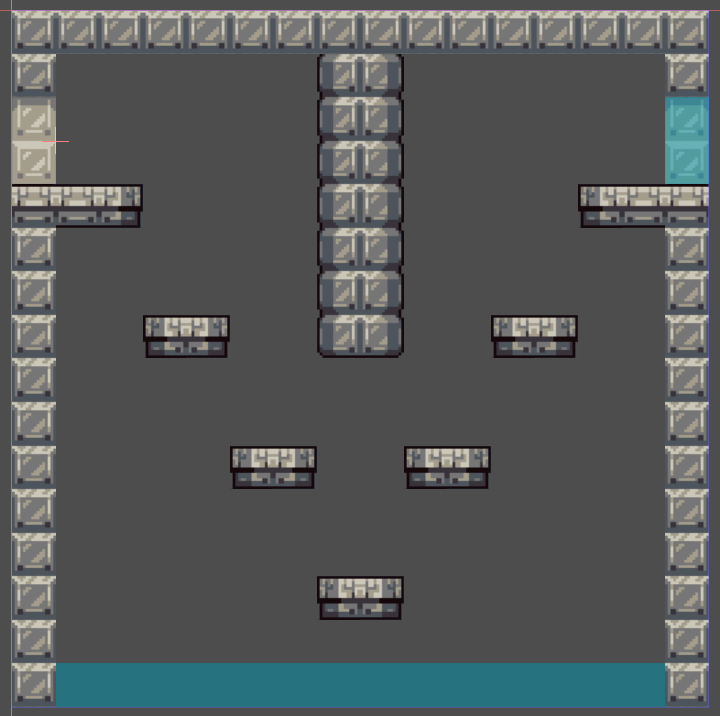
We wanted to do everything we could to keep the game simple. Because of this, we decided to stick with a single screen platformer. Keeping it all on one screen means that everything is not only visible to players from the get-go, but also easier on our designers. We can see, at a glance, exactly how each room was to play out, and could jam out levels quickly and efficiently, easily hitting our 20 level goal.
Don't over-complicate things where you don't need to. Your players just want to play your game.

As a bonus, due to the sheer simplicity of it and obvious metrics shown mid game and at the end of the game, you can easily challenge others with this, getting competitive, for those who manage to complete it. We actually thought of doing leaderboards for this, but alas, we don't exactly have the resources to host our own servers for this at the moment. Would not have been difficult to do, but it's just a bit far out of scope for this game. If only.
We wanted to keep the visual design simple, but consistent. We mostly stuck to one tileset, modified it a bit where needed, and kept the extra assets aside from that at a minimum. Keep it consistent, keep it simple. That's what we've seen a lot of successful jam games do - keep it simple, but also keep it consistent.
This was a great test for our design skills (Skylar Zero did an amazing job with the levels and with balancing the difficulty and the physics of the game) and was all around a fun - though infuriating - game to develop, even all throughout testing. With fast iteration with good tooling, it was a dream to work with, and I couldn't be happier with how well the jam went.

Leave a comment
Log in with itch.io to leave a comment.